LAST FREE NATION
PREMIER ESPORTS PODCAST NETWORK
re-design
5 min read
Role: Product Designer
Responsibilities: User Research, Branding, Wireframing, Prototyping, Testing
Timeframe: 3 weeks
OVERVIEW
Note: LFN is short for Last Free Nation.
In this project I took on the task of redesigning an existing website. The goal was to help LFN better connect with their existing audience and appeal to new fans. Brand identity came first followed by a clear presentation of content.
LFN already has a strong brand identity but their site is outdated. It doesn't reflect the quality of the work they do covering multiple esports titles and the esports industry itself. They lack a way of directly communicating with their whole audience effectively without having to go through separate channels.
OBJECTIVE
To create a site that will act as a central hub which will anchor all the vast sectors of the LFN network. It will allow their audience to access all their content in one place, and create a direct connection between both parties. LFN want the site to be scalable with the possibility of implementing new features in the future.
UNDERSTANDING
THE PROBLEM
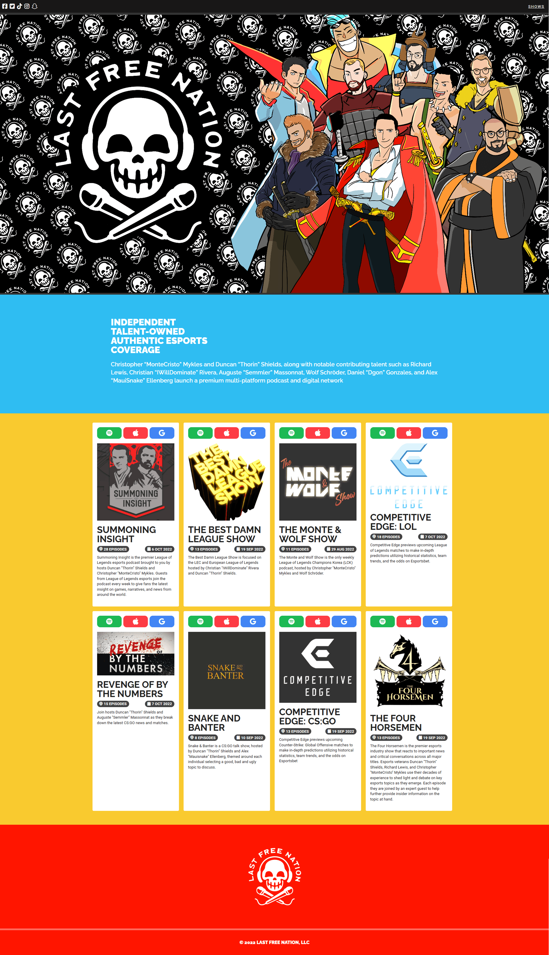
The first step of the project was to get familiar with the current version of the LFN website to identify key pain points. The website felt abandoned. Content was missing, outdated or inconsistent. This immediately confuses the user making them think they might be in the wrong place.
There was no clear information about the brand in the hero section. It didn't communicate what LFN represents or what they do, making it hard to understand the purpose of the site. It assumed every user would know exactly where to go, weakening the first impression and failing to capture the user's attention.
No clear calls to action made it difficult for users to understand what step to take next. This could turn away both first time visitors as well as existing audience members — leading them to potentially leave the site without getting to see any of the available content.
CONCLUSION
This research allowed me to break down the problem into the following key points which would guide me during later stages of this project.
first impression
call to action
brand identity
purpose
engagement
branding
SITE BEFORE
DEFINING
THE SOLUTION
With the problem identified the next step was to understand what the correct solution is. The key goals I set were to
One: Clearly explain what the LFN brand is, what they do, and what they stand for.
Two: Make sure the content they create is well presented and structured.
Three: Create a connection with both new and loyal fans from the moment they land on the site.
The success of the solution could be measured in the future through measuring user engagement compared to the previous version.
I chose to equally prioritise presenting content and introducing the talent team of LFN. The reason for that was because they are drives LFN and makes their audience consume the content itself.
WIREFRAMES
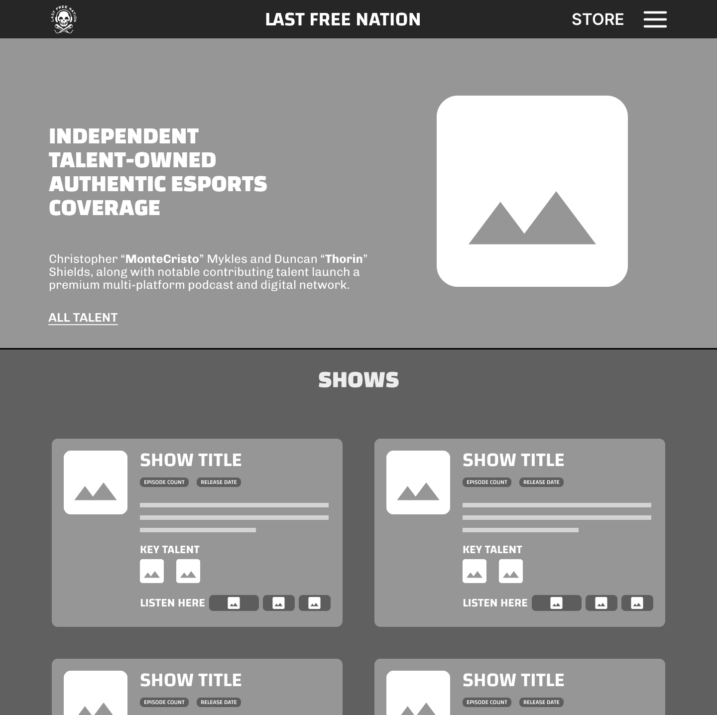
HOME PAGE
The hero section of the homepage now clearly shows what
LFN is and what they do — users no longer need to scroll
down to see information.
I made the navigation bar more
Content is now presented more clearly. I changed the
information hierarchy and made each card uniform.
The show title and show cover photo take the spotlight, followed
by the show description and information on key talent.
There is more space between information making it easily
readable and visually pleasing.
The buttons linking to platforms where the shows can be seen
now have a label to let the user know what they do. The platforms
are listed in priority order from left to right with the first button
being larger than the other two signifying that it's the most
important one.
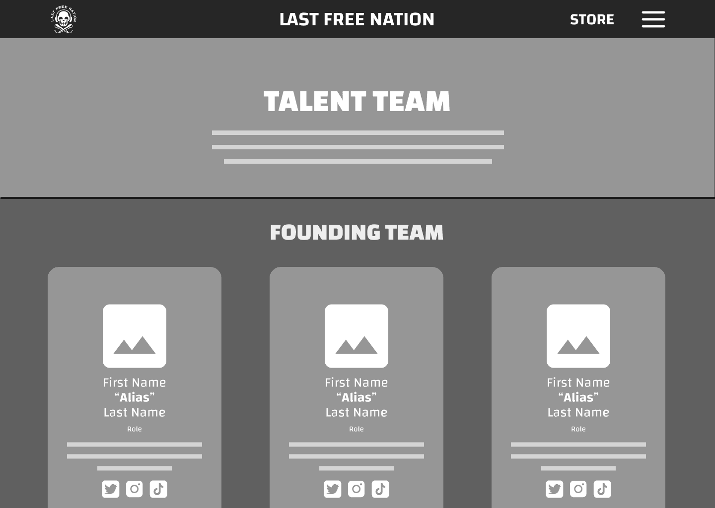
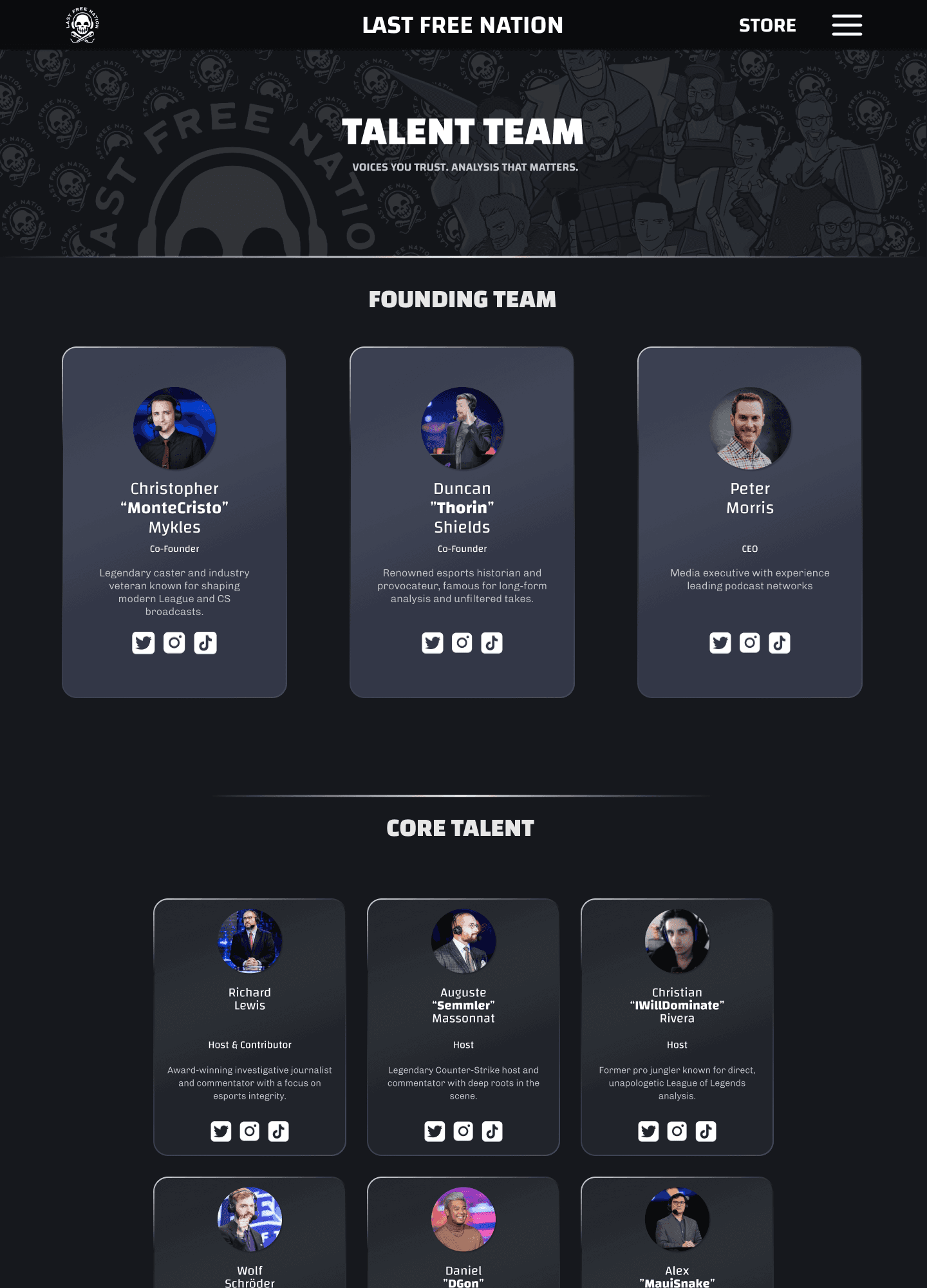
TALENT PAGE
The first new addition to the site is the talent page. It showcases
all the LFN team members, their role, and their social media
accounts.
The page promotes transparency and building a connection with
the audience by letting them learn more about their favourite
hosts, and get to know ones they're less familiar with.
This aligns with LFN's focus on being a talent-owned network
and allows their audience to learn more about their team.
The page further splits into two sections, separating the founding
team from the core team members. It gives the reader a deeper
understanding of the hierarchy within LFN.
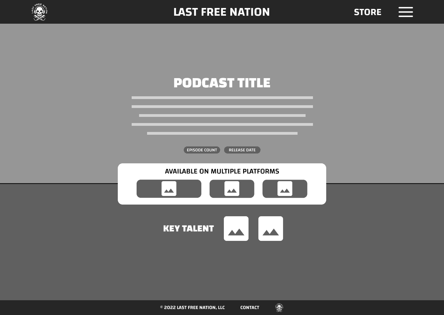
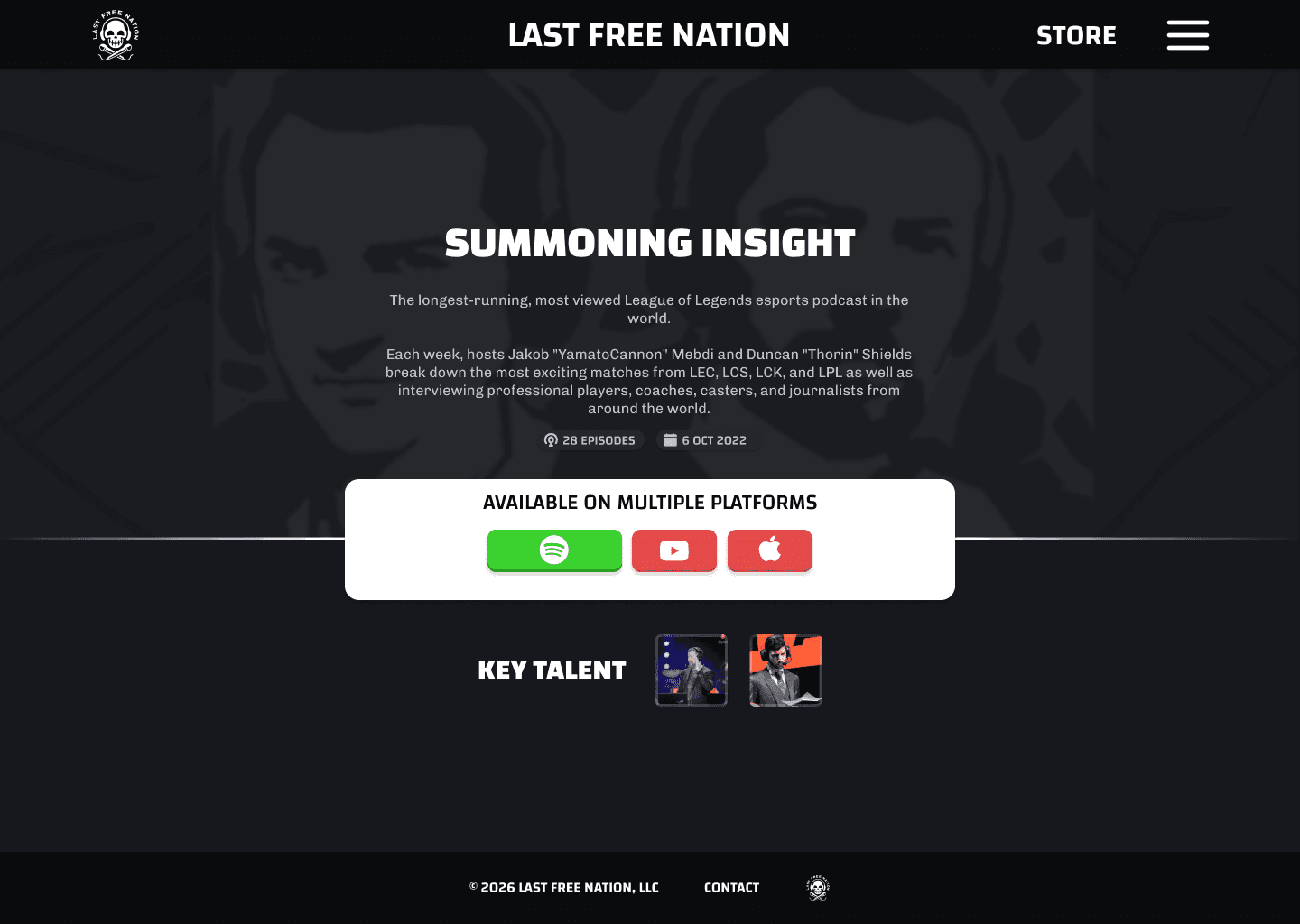
SHOW PAGE
Each show now has its own dedicated page where the audience
can learn more about it.
This is a building block to which more features can be added in
the future such as latest episodes, episode discussion,
announcements etc.
By creating a separate page for each show, a lot more detail can
be added for diehard fans.
If this information was all crammed in the homepage shows
section it could overwhelm new visitors.
PROTOTYPING
HOME PAGE
The hero section makes use of the previous image for the banner
but it has been desaturated. This allows it to still be visible and be
the clear centre piece without distracting from the text.
The use of colour within the cards makes them stand out more,
contrasting well with the warm, less saturated background.
The brand identity is strong and explains what LFN is with a single
look at the page.
It feels professional and modern with hints of character — this
ties in well with the brand's values.

TALENT PAGE
The page is very easy to understand and displays all the
necessary information about the LFN team.
The secondary message is quick and catchy, reflecting the team's
experience and reputation — it
The founding team cards highlight the importance of the founding
members and highlights their position within the team hierarchy.
Each team member has a personalised description that show the
audience who they are, and their achievements.
SHOW PAGE
Each page feels personal and provides further details about the
show it represents.
It has a lot of free space which will allow the implementation of
new features in the future. This could include a list of recent
episodes, trivia and facts about the show, or hints towards the
upcoming episode.
This page aims to help new audience members learn about
specific shows, and to give existing fans a chance to feed their
curiosity.
REFLECTIONS
This project taught me how to improve an existing product while working within real constraints, rather than designing from a blank slate. It helped me better understand how to create an interface that represents and respects an established brand identity, while still addressing usability and clarity issues.
The focus wasn’t on creating the most perfect or visually polished solution, but on thoughtfully translating a pre existing message and set of values into an interface that's appealing for users.
Throughout this process, I learned how design decisions can reinforce trust, consistency, and familiarity, ultimately helping create a more meaningful connection between the product and its users.
This project pushed me to think more critically - I wasn't building a final product, I was building a scalable foundation.
LAST FREE
NATION
PREMIER ESPORTS PODCAST
NETWORK
re-design
5 min read
Role: Product Designer
Responsibilities: User Research, Branding, Wireframing, Prototyping, Testing
Timeframe: 3 weeks
OVERVIEW
Note: LFN is short for Last Free Nation.
In this project I took on the task of redesigning an existing website. The goal was to help LFN better connect with their existing audience and appeal to new fans. Brand identity came first followed by a clear presentation of content.
LFN already has a strong brand identity but their site is outdated. It doesn't reflect the quality of the work they do covering multiple esports titles and the esports industry itself. They lack a way of directly communicating with their whole audience effectively without having to go through separate channels.
OBJECTIVE
To create a site that will act as a central hub which will anchor all the vast sectors of the LFN network. It will allow their audience to access all their content in one place, and create a direct connection between both parties. LFN want the site to be scalable with the possibility of implementing new features in the future.
UNDERSTANDING
THE PROBLEM
The first step of the project was to get familiar with the current version of the LFN website to identify key pain points. The website felt abandoned. Content was missing, outdated or inconsistent. This immediately confuses the user making them think they might be in the wrong place.
There was no clear information about the brand in the hero section. It didn't communicate what LFN represents or what they do, making it hard to understand the purpose of the site. It assumed every user would know exactly where to go, weakening the first impression and failing to capture the user's attention.
No clear calls to action made it difficult for users to understand what step to take next. This could turn away both first time visitors as well as existing audience members — leading them to potentially leave the site without getting to see any of the available content.
CONCLUSION
This research allowed me to break down the problem into the following key points which would guide me during later stages of this project.
first impression
call to action
brand identity
purpose
engagement
branding
SITE BEFORE
DEFINING
THE SOLUTION
With the problem identified the next step was to understand what the correct solution is. The key goals I set were to
One: Clearly explain what the LFN brand is, what they do, and what they stand for.
Two: Make sure the content they create is well presented and structured.
Three: Create a connection with both new and loyal fans from the moment they land on the site.
The success of the solution could be measured in the future through measuring user engagement compared to the previous version.
I chose to equally prioritise presenting content and introducing the talent team of LFN. The reason for that was because they are drives LFN and makes their audience consume the content itself.
WIREFRAMES
HOME PAGE
The hero section of the homepage now clearly shows what LFN is and what they do — users no longer need to scroll
down to see information.
Content is now presented more clearly. I changed the
information hierarchy and made each card uniform.
The show title and show cover photo take the spotlight, followed
by the show description and information on key talent.
There is more space between information making it easily
readable and visually pleasing.
The buttons linking to platforms where the shows can be seen now have a label to let the user know what they do. The platforms
are listed in priority order from left to right with the first button being larger than the other two signifying that it's the most
important one.
TALENT PAGE
The first new addition to the site is the talent page. It showcases
all the LFN team members, their role, and their social media
accounts.
The page promotes transparency and building a connection with
the audience by letting them learn more about their favourite
hosts, and get to know ones they're less familiar with.
This aligns with LFN's focus on being a talent-owned network
and allows their audience to learn more about their team.
The page further splits into two sections, separating the founding
team from the core team members. It gives the reader a deeper
understanding of the hierarchy within LFN.
SHOW PAGE
Each show now has its own dedicated page where the audience
can learn more about it.
This is a building block to which more features can be added in
the future such as latest episodes, episode discussion,
announcements etc.
By creating a separate page for each show, a lot more detail can
be added for diehard fans.
If this information was all crammed in the homepage shows
section it could overwhelm new visitors.
PROTOTYPING
HOME PAGE
The hero section makes use of the previous image for the banner
but it has been desaturated. This allows it to still be visible and be
the clear centre piece without distracting from the text.
The use of colour within the cards makes them stand out more,
contrasting well with the warm, less saturated background.
The brand identity is strong and explains what LFN is with a single
look at the page.
It feels professional and modern with hints of character — this
ties in well with the brand's values.
TALENT PAGE
The page is very easy to understand and displays all the
necessary information about the LFN team.
The secondary message is quick and catchy, reflecting the team's
experience and reputation — it
The founding team cards highlight the importance of the founding
members and highlights their position within the team hierarchy.
Each team member has a personalised description that show the
audience who they are, and their achievements.
SHOW PAGE
Each page feels personal and provides further details about the
show it represents.
It has a lot of free space which will allow the implementation of
new features in the future. This could include a list of recent
episodes, trivia and facts about the show, or hints towards the
upcoming episode.
This page aims to help new audience members learn about
specific shows, and to give existing fans a chance to feed their
curiosity.
REFLECTIONS
This project taught me how to improve an existing product while working within real constraints, rather than designing from a blank slate. It helped me better understand how to create an interface that represents and respects an established brand identity, while still addressing usability and clarity issues.
The focus wasn’t on creating the most perfect or visually polished solution, but on thoughtfully translating a pre existing message and set of values into an interface that's appealing for users.
Throughout this process, I learned how design decisions can reinforce trust, consistency, and familiarity, ultimately helping create a more meaningful connection between the product and its users.
This project pushed me to think more critically - I wasn't building a final product, I was building a scalable foundation.
